Vimeo for iOS
iOS Mobile and Tablet Apps · UX, UI, Art Direction

A reimagined video experience featuring a simplified navigation, elegant discovery and playback features, and a handsome new interface.

Fig 01. The old app suffered from fragmented navigation and features, and it lacked a visual system deserving of Vimeo's amazing content.

Fig 02. First, we defined a simpler architecture and feature set. After a handful of conversations, a new direction was chosen.

Fig 03. Next, detailed wireframes refined product decisions and user interactions. Pictured are the new Feed, Explore, and Playlist sections.

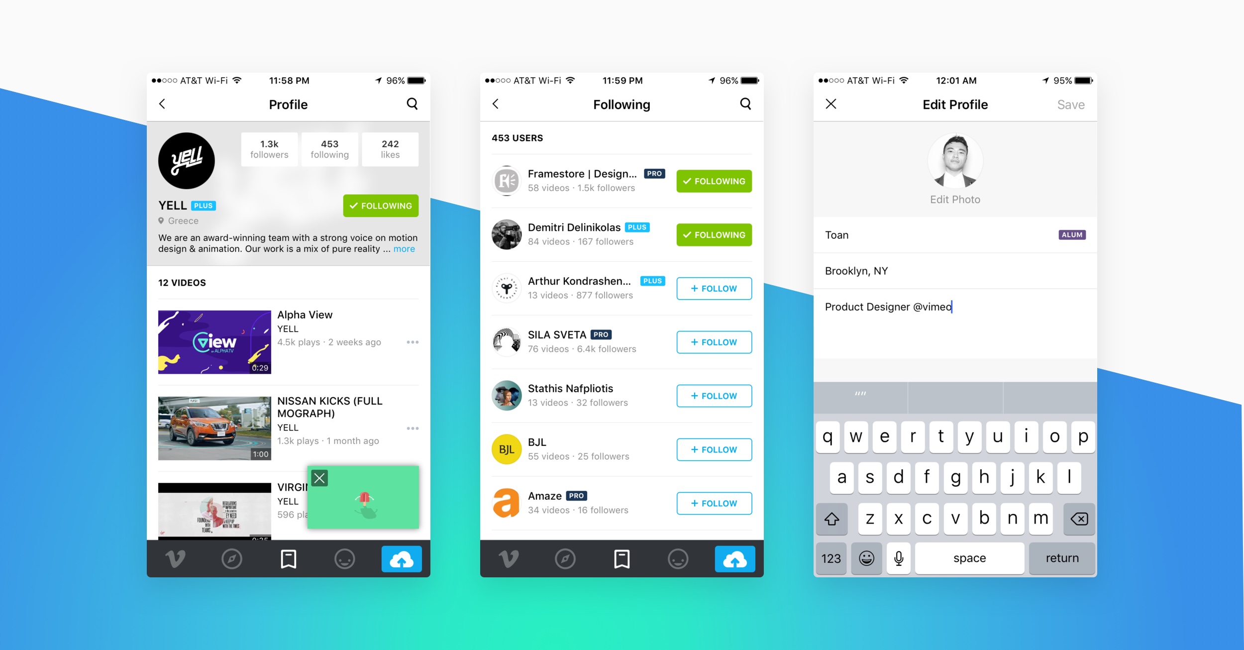
Fig 04. The Profile and all-new Vimeo Player.

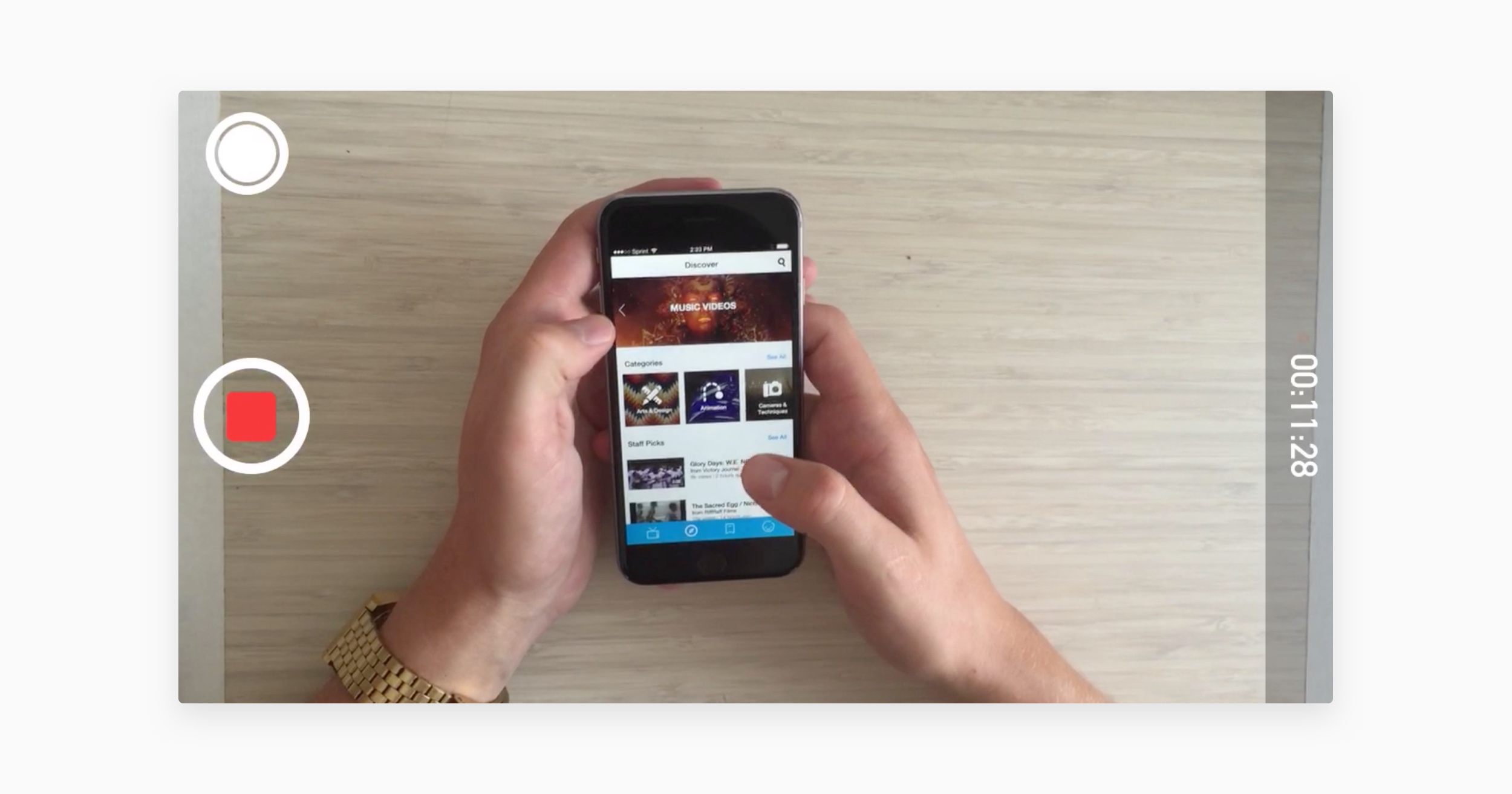
Fig 05. Interactive prototypes were built to identity pain points and test feature discoverability with real users.

Fig 06. The new visual system required balancing Vimeo's existing products, brand guidelines, multiple mobile platforms, and a strong focus on content.

Fig 07. A welcome screen greets users with stunning hand-picked videos. After that, an animated onboarding flow makes following categories, users, and channels fun.

Fig 08. Edge-to-edge imagery fills the new Feed, and features like the mini player and offline playback ensure smooth, uninterrupted viewing.

Fig 09. The Explore page makes browsing Staff Picks, Categories, and Channels super easy.

Fig 10. A Library houses Offline and Watch Later playlists. It's also where On-Demand Purchases and Series live.

Fig 11. The new Profile allows creators to showcase their amazing videos to the world.

Fig 12. The player is a core part of the viewing experience and features minimal controls, a custom recommendations engine, offline playback, and in-screen commenting.

Fig 13. The app was optimized for tablet viewing, using the extra space to offer more dynamic browse and playback functionality.
